TILESHUB
BACKGROUND
TilesHub is a specialist in supplying handpicked, durable porcelain and ceramic tiles for those on a budget.
We were tasked with creating a new brand identity for TilesHub to refresh their logomark, typography and colour palette to accurately reflect the brand and the customers it attracts. We also developed how the brand could be applied to different touchpoints such as web, shop front, social and mobile applications.
APPROACH
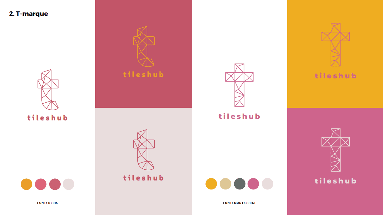
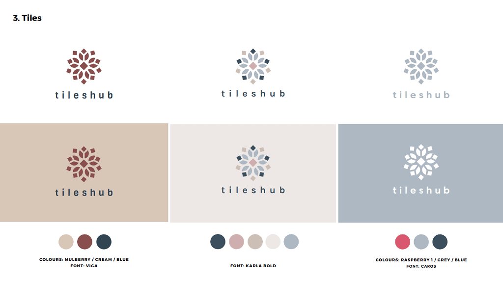
Following an intensive day-long brand workshop, we produced a number of concepts that experimented with geometric shapes and feminine colour schemes to align with the product offering and target audience. This included a master ‘T marque’, the image of an elephant and traditional tile patterns.
We also worked with the team to develop the brand’s communications and key messages with a specific focus on social media and content creation as these were areas that required the greatest development and time investment.
Industry
Building Products
Social Media
Location
Services
Social Media


RESULTS
The geometric elephant was chosen as the brand marque because of its historical symbolism and strong parallels to every strand of the business. The animal represents patience, wisdom, strength, loyalty and strong familial bonds that mirrored the values of TilesHub as a family-run business, the South Asian heritage of the team, the strength and durability of the products they offer and the origins of the products they source.
These themes are enhanced through the use of the calm turquoise and contrasting pink to represent harmony, safety and compassion – values that also aligned with their core female target market. Following the development of the visual identity, we also created a brand messaging playbook and social media strategy.


